
Understanding Colour Psychology in Label Design: How to Influence Consumer Behavior
26th Dec 2025
Have you ever wondered why certain products immediately catch your eye on a crowded store shelf while others barely register? The answer often lies not in the product itself, but in the subtle power of colour. Colour psychology in label design plays a significant role in shaping consumer perceptions, influencing emotions, and ultimately driving purchasing decisions. Studies show that colour can increase brand recognition by up to 80% and significantly impact buying behaviour. In the world of packaging and labelling, understanding how colours affect consumer response is no longer optional—it’s a necessity.
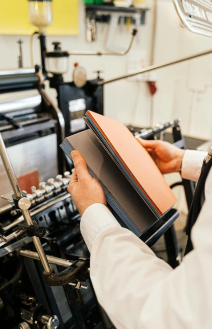
At DuraFast Label Company, we understand that labels are more than just identifiers; they are powerful tools that communicate quality, reliability, and brand personality. By leveraging the science of colour psychology and pairing it with high-quality colour label printers and durable materials such as vinyl or weatherproof labels, businesses can make labels that not only stand out but also inspire trust and confidence.
In this article, we’ll examine the psychology behind colours in label design, discuss how different shades affect consumer behaviour across industries, and share practical strategies to create labels that connect with buyers.
The Importance of Colour in Label Design
Labels are often the first point of contact between a product and a consumer. While the product itself matters, the visual impact of a label can make or break a sale. Colour is a key factor because it communicates emotion instantly and subconsciously. For instance, red can evoke urgency or excitement, while blue often conveys trust and reliability.
When designing labels, it’s crucial to consider:
- Brand identity: Colours should reflect your brand values.
- Target audience: Different demographics respond differently to colour.
- Industry expectations: Certain colours are more effective in particular sectors.
- Psychological triggers: Colours can influence mood, perception of quality, and perceived value.
A well-designed label using appropriate colour psychology can not only draw attention but also create emotional connections that encourage repeat purchases.
How Colour Influences Consumer Perception
Consumers often make split-second decisions based on visual cues. Colour can influence perceptions of taste, quality, and brand reliability without the buyer even realising it. Here’s how:
- Red: Creates a sense of urgency and excitement, making it ideal for promotions or food products.
- Blue: Associated with trust, stability, and calmness; commonly used in healthcare, finance, and tech.
- Green: Suggests health, sustainability, and natural ingredients; effective in food, wellness, and eco-friendly products.
- Yellow: Evokes optimism and attention; useful for clearance or sale signage.
- Orange: Energetic and playful; encourages action and engagement.
- Purple: Conveys luxury, sophistication, and creativity; often used in beauty and high-end products.
- Black: Communicates sophistication, power, and elegance; excellent for premium items.
- White: Signifies simplicity, purity, and cleanliness; ideal for minimalistic and healthcare products.
By aligning colours with the intended emotional response, businesses can subtly guide consumers toward desired behaviours.
Colour Psychology in Different Industries
Food and Beverage
Colour choices in food packaging can influence perceived taste and freshness:
- Red and yellow: Trigger appetite and grab attention quickly.
- Green: Suggests organic or natural ingredients.
- Brown and beige: Convey wholesomeness and warmth.
For example, beverage labels that use vibrant hues like orange or red can signal energy and refreshment, while muted greens may indicate organic or environmentally conscious options. Using high-quality colour label printers ensures that these hues remain consistent across production runs, maintaining brand credibility.
Health and Beauty
Consumers often associate certain colours with product efficacy:
- Blue: Trust and reliability, often used for dental or skincare products.
- White: Cleanliness and purity, common in hygiene or health supplements.
- Pink and pastels: Softness and care, appealing in personal care and cosmetic items.
Wash care label printers and precise colour control are essential here, as consumers expect labels to reflect product quality and professional presentation.
Automotive and Industrial
In these sectors, colours communicate safety, durability, and functionality:
- Black and grey: Strength, sophistication, and durability.
- Yellow or orange accents: Safety and attention-grabbing details.
- Red highlights: Performance and urgency for oil change labels or maintenance indicators.
Weatherproof labels and thermal transfer labels are often used to withstand harsh environments, ensuring that crucial information remains legible over time.
Retail and Lifestyle
Retail products rely heavily on colour psychology to catch attention in crowded shelves:
- Bright, bold colours: Stimulate interest and impulse buying.
- Soft pastels: Suggest elegance and approachability.
- Metallics: Convey premium value and luxury.
High-quality colour label printers allow businesses to reproduce vibrant hues accurately, helping labels stand out while maintaining brand consistency.
The Science Behind Colour Perception and Its Practical Application in Label Design
Colour is far more than a decorative element in label design—it is a language of its own, communicating messages and emotions even before a consumer reads a single word. Understanding the science behind colour perception is essential for creating labels that resonate with target audiences and influence purchasing decisions. When applied thoughtfully, colour psychology in label design becomes a powerful tool that can significantly affect consumer engagement, trust, and behaviour.
In this section, we will take a deeper look at the underlying mechanisms of colour perception, the psychological responses colours evoke, and how to apply these insights practically when designing labels. We will also explore material considerations, printing technologies, and testing strategies to ensure your labels maintain their intended impact in the real world.
How Humans Perceive Colour: A Deeper Look
The human perception of colour begins with light. Light enters the eye and stimulates photoreceptor cells in the retina—cones, which are sensitive to different wavelengths of light corresponding to red, green, and blue. The brain processes signals from these cones to create the experience of colour. While this biological process is universal, perception is far from uniform because external factors, cognitive biases, and personal experiences shape how colours are interpreted.
Key Factors Influencing Colour Perception
Cultural Associations
Colours carry different meanings across cultures, and failing to consider these differences can lead to unintended messages. For example:
- White: In Western cultures, white is linked to purity, cleanliness, and simplicity, making it ideal for medical products or minimalist packaging. In some Eastern cultures, however, white is associated with mourning and funerals.
- Red: Often signals excitement, energy, or urgency in Western contexts, while in China, red is linked to luck, prosperity, and celebration.
- Green: Universally associated with nature and health, but in some regions, it may also symbolize jealousy or inexperience.
Label designers must consider the cultural context of their audience to ensure that colour choices align with intended messaging.
Contrast and Visibility
A label may be beautifully designed, but if the colours do not stand out against the product or packaging background, it fails in its purpose. High contrast is crucial for readability, particularly for text-heavy labels. For example, black text on a yellow background is highly legible and attention-grabbing, while dark blue text on a dark green background can be difficult to read. Contrast also affects perceived importance; elements with higher visual contrast are perceived as more significant, which can guide a consumer’s attention to key information, such as nutritional details, pricing, or product benefits.
Colour Combinations
The relationships between colours significantly affect how a label is perceived. Designers often rely on three primary approaches:
- Complementary Colours: Colours opposite each other on the colour wheel (e.g., blue and orange) create strong visual contrast and draw attention. This technique is often used to highlight critical features or promotional elements on labels.
- Analogous Colours: Colours adjacent on the colour wheel (e.g., green, blue-green, blue) create visual harmony and a sense of cohesion, often associated with calmness, balance, or natural products.
- Triadic Colours: Using three evenly spaced colours on the colour wheel can produce vibrant yet balanced combinations. This approach works well for lifestyle products aiming to appear dynamic and lively without overwhelming the consumer.
Psychophysiological Responses
Colours do not only affect perception—they also elicit measurable physiological and psychological responses. Studies show that:
- Red: Increases heart rate and creates a sense of urgency or excitement. This is why red is commonly used on food packaging or promotional labels where quick purchase decisions are desired.
- Blue: Promotes calmness and trust. It is frequently used in health, wellness, and financial product labels.
- Green: Evokes relaxation and the perception of natural, environmentally friendly products.
- Yellow: Stimulates attention and optimism, often used in clearance or sale messaging.
By understanding these responses, label designers can strategically guide emotional reactions and influence purchase decisions at a subconscious level.
Practical Strategies for Applying Colour Psychology in Label Design
Understanding the science of colour is only part of the process. Applying these insights in a practical, structured manner ensures that labels perform their intended function and communicate the right message.
1. Define Your Brand Personality
Every label communicates your brand personality, even before a consumer reads the text. Ask yourself: What emotions or values do we want to convey? The colour palette should reflect this identity.
- Trustworthy and Professional: Blues, greys, and muted tones communicate reliability.
- Energetic and Fun: Oranges, reds, and bright yellows suggest excitement and engagement.
- Natural and Sustainable: Greens, browns, and earthy tones reinforce organic or eco-conscious values.
- Premium and Luxurious: Black, deep purples, and metallics signal sophistication.
Consistency in colour usage across all labels builds a recognizable and cohesive brand identity.
2. Consider Your Target Audience
Colour preference can vary depending on age, gender, cultural background, and even lifestyle. For instance:
- Age Differences: Younger audiences may respond positively to bright, bold colours, while older demographics might prefer subdued, easy-to-read combinations.
- Gender Differences: Studies suggest women tend to prefer softer tones and pastels, whereas men often gravitate toward bold, strong colours.
- Cultural Differences: Always align colour selection with the cultural context of your market to avoid misinterpretation.
Taking these factors into account increases the likelihood that your labels resonate with the intended audience.
3. Use Contrast Strategically
Labels need to be readable in various environments—from store shelves to online product images. Contrast helps:
- Highlight important information such as ingredients, warnings, or instructions.
- Draw attention to promotional elements like discounts or new product features.
- Improve accessibility for consumers with visual impairments, ensuring everyone can interact with your product confidently.
4. Prioritize Readability
Effective label design balances aesthetic appeal with functionality. Colour choices should enhance readability, not hinder it. Tips include:
- Using dark text on light backgrounds or vice versa.
- Avoiding clashing colours that strain the eyes.
- Selecting fonts and sizes that remain legible even when the label is scaled down.
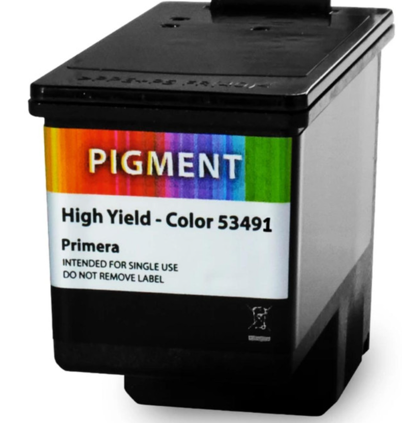
High-quality colour label printers, paired with suitable toners for label printers, ensure that text and graphics retain clarity and accuracy during production.
5. Test Your Labels
No matter how well-researched, assumptions about colour perception can be misleading. Testing labels through mockups or focus groups provides actionable insights. Key testing methods include:
- A/B Testing: Compare two colour schemes to determine which elicits the desired consumer response.
- Focus Groups: Gather feedback on emotional impact, readability, and appeal.
- Shelf Testing: Observe how labels perform in real-world retail environments, including lighting and competitor product placement.
Testing helps identify subtle issues that could affect consumer perception and ensures labels communicate the intended message.
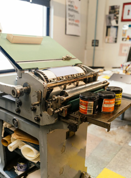
6. Choose the Right Material
The impact of colour extends beyond the design itself. Material choice affects durability, legibility, and colour retention:
- Vinyl Labels: Highly durable, resistant to moisture, UV light, and physical wear. Ideal for outdoor, automotive, and industrial products.
- Weatherproof Labels: Maintain colour fidelity even under extreme environmental conditions, protecting brand image and information clarity.
- Thermal Transfer Labels: Excellent for barcodes, oil change labels, and long-lasting identification.
- Wash Care Label Printers: Produce labels that retain readability and colour integrity even after repeated washing.
Selecting the right material ensures that the psychological impact of your colour choices remains effective over the product’s lifecycle.
7. Match Printing Technology
High-quality printing technology is critical for translating design into reality. Inconsistent or low-quality prints can distort colours, weaken brand identity, and undermine the effectiveness of colour psychology. Best practices include:
- High-Quality Colour Label Printers: Capable of reproducing vibrant, accurate colours consistently.
- Compatible Toners for Label Printers: Ensure colour accuracy and prevent fading or smudging.
- Regular Calibration: Maintain colour fidelity across production runs.
By pairing the correct material with reliable printing solutions, brands can ensure labels meet both aesthetic and functional requirements.
Integrating Colour Psychology with Overall Label Strategy
To fully leverage colour psychology in label design, it is essential to consider the broader context of branding and product presentation. Strategies include:
- Consistency Across Product Lines: Uniform colour schemes strengthen brand recognition and trust.
- Highlighting Key Information: Use contrasting or attention-grabbing colours for essential product details.
- Balancing Function and Emotion: Labels must be both visually appealing and informative.
- Durable Materials for Long-Term Impact: Weatherproof and vinyl labels maintain the designed visual impact and readability.
By integrating these approaches, labels not only capture attention but also influence perception, enhance trust, and drive purchase decisions.
Colour Consistency Across Printing Methods
Colour reproduction can vary depending on the printing method. Choosing the right equipment is vital:
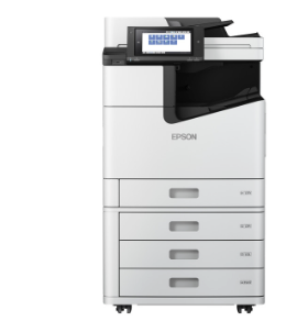
- Thermal Label Printers: Ideal for high-speed production and consistent colour on durable labels. We recommend considering options for those who want to buy thermal label printers online.
- Inkjet or Laser Colour Label Printers: Produce detailed graphics and vibrant colours; suitable for retail, food, and beauty sectors.
- Toners and Consumables: Using quality toners for label printers ensures consistent colour output and prevents fading over time.
Ensuring consistency in colour and print quality builds trust and reinforces brand recognition.
Selecting the Right Label Materials
The effectiveness of colour psychology in label design is closely tied to the material used. Key options include:
- Vinyl Labels: Durable and weather-resistant; ideal for outdoor or industrial products.
- Weatherproof Labels: Protect against moisture, UV light, and temperature fluctuations; perfect for automotive or chemical products.
- Thermal Transfer Labels: Long-lasting and high-quality; suitable for barcodes, instructions, and compliance information.
- Oil Change Labels: Require resilience to oils and chemicals; colour coding can communicate maintenance schedules efficiently.
- Laser Sheet Labels: Provide precision and flexibility; suitable for promotional or retail items.
Choosing the correct material ensures that labels maintain their visual impact and communicate the intended message effectively.
Leveraging Colour to Influence Purchase Decisions
Research shows that consumers make up their minds about products within 90 seconds of initial exposure, and that decision is mostly influenced by colour. Brands can strategically use this knowledge:
- Highlight Promotions: Use red or orange to draw attention to discounts or new products.
- Communicate Premium Quality: Black, gold, and silver tones suggest luxury.
- Encourage Impulse Buys: Bright, contrasting colours can stimulate quick purchasing decisions.
- Signal Health or Sustainability: Greens and earthy tones appeal to eco-conscious buyers.
Integrating these insights with durable labels and high-quality printing enhances both shelf presence and consumer trust.
Implementing Colour Strategies Across Product Lines
- Segment Your Products: Use different colour themes for various product categories to aid recognition.
- Use Consistent Brand Colours: Maintain cohesion across all packaging to reinforce brand identity.
- Highlight Key Information: Use contrasting colours to draw attention to expiry dates, ingredients, or safety instructions.
- Invest in Quality Printing Equipment: High-quality colour label printers and compatible toners for label printers ensure the colours are true-to-design.
- Test for Longevity: Especially for vinyl labels and weatherproof labels, test under real-world conditions to ensure the label maintains readability and visual appeal.
Adopting these strategies ensures that colour psychology delivers tangible benefits.
Future Trends in Colour Label Design
- Sustainability: Eco-friendly inks and materials are increasingly influencing colour choices.
- Digital Personalization: Colour label printers with digital capabilities allow small-batch customization.
- Interactive Labels: Incorporating QR codes with strategic colour highlights enhances consumer engagement.
- Enhanced Durability: Weatherproof labels and thermal transfer options provide long-lasting visibility, supporting consistent brand messaging.
Staying ahead in label design requires combining colour psychology insights with the latest printing technologies and materials.
Maximizing ROI Through Effective Colour Label Design
Investing in high-quality labels is not just about aesthetics; it’s a strategic decision:
- Increase Shelf Impact: Vibrant colours attract attention.
- Enhance Brand Recognition: Consistent colour schemes reinforce brand identity.
- Reduce Returns: Clear, readable labels decrease consumer confusion.
- Boost Sales: Emotionally resonant colours influence purchase decisions.
By pairing these strategies with durable materials and reliable printing solutions, businesses can achieve a higher return on investment for their label design efforts.
Are You Using Colour Psychology to Its Full Potential in Your Labels?
If your labels fail to stand out or connect with your audience, it might be time to reconsider your approach. At DuraFast Label Company, we provide a wide range of solutions to help you harness the power of colour psychology in label design. From vinyl labels to weatherproof labels and thermal transfer label, we ensure your designs maintain their impact in any environment. Our high-quality colour label printers and toners for label printers make it possible to achieve precise, consistent colour reproduction that elevates your brand’s presentation.
By choosing us, you gain access to durable materials, reliable printing technology, and expert support to ensure every label communicates your brand message effectively. Whether you need oil change labels, wash care labels, or laser sheet labels for promotional purposes, we provide the tools and materials that help you achieve professional results.
Take the next step in making your labels more than just identifiers—turn them into a powerful influence on consumer behaviour. Order your labels and consumables from DuraFast Label Company today and see how colour psychology in label design can transform your brand presence.