
Discover the Best Colours for Product Labels to Boost Sales
11th Jul 2025
Colour psychology in product packaging is a powerful tool that can significantly influence consumer behaviour and boost sales. The right colour choice on your label goes beyond aesthetics—it taps into emotions and subconscious associations that affect purchasing decisions. For example, cool colours like blue evoke trust, red sparks energy, and green brings calm, while white can symbolize relaxation and lightness, all of which shape how consumers perceive and choose your product.
Many successful brands have already used colour psychology to differentiate themselves and connect with their target audience. Scientific research backs up the impact of colour on sales, proving that the right hues can make all the difference. By understanding colour meanings and strategically applying them to your label design, you can increase product appeal and drive growth.
Ready to transform your product packaging? Explore practical tips and tools to implement colour psychology in your designs and stand out on the shelf.
What is Colour Psychology in Product Label Design?
Colour psychology plays a crucial role in product packaging, influencing consumer behaviour and boosting sales. It's more than just selecting a pretty colour palette—it's about strategically using specific colours to trigger emotions and subconscious responses. The importance of colour lies in how the human eye interprets it in our daily lives, affecting everything from appetite to mental activity and feelings of hunger.
For instance, blue—a popular colour blue in the beverage industry and skincare products—evokes trust and calm. Red, on the other hand, increases energy and metabolism, making it a great colour for food purchases or attention-grabbing labels. Green symbolizes health, prosperity, and nature, while white conveys cleanliness, lightness, and spirituality. Yellow brings joy and positivity but also signals caution, making it a single colour with a powerful impact depending on the context.
Whether you're creating labels for outdoor recreational equipment, beverages, or beauty products, the right colours—and the right colour combinations—can directly impact customer decisions. That’s why understanding colour theory, the colour wheel, complementary colours, and how they relate to your brand's vibe is essential.
Top brands master the use of colour schemes and artwork to stand out. They tailor their packaging to match their audience’s favourite colour, even adapting designs to reflect cultural associations with colours like black for mourning or pink for femininity.
Scientific studies show that colour influences blood pressure, appetite, and perception—proving that even a single colour choice can have a massive effect. Whether you're using thermal transfer printing or digital presses, selecting specific colours aligned with your brand's message is key.
Do Colours have an Impact on Consumer Behavior?

Colours play a substantial role in shaping consumer behaviour by conveying subliminal messages. Each colour can elicit distinct emotional responses and associations, affecting our perception and judgement. For instance, red typically induces a sense of urgency and desire, while blue inspires trust and reliability.
Therefore, understanding the correlation between colour and consumer behaviour can assist in choosing the best colours for product labels, enabling brands to influence purchasing decisions subtly and effectively. This understanding is pivotal in creating a label that does not merely attract the eye but also stirs emotions and motivates action.
How can Colours influence Emotions and Decisions?
Colours have a powerful impact on our emotions and decisions, often influencing our reactions without us even realizing it. Here's how:
-
Emotional Triggers: Colours are deeply connected to emotions. For example, green evokes calmness and happiness, thanks to its natural and tranquil associations. On the other hand, black conveys sophistication, stability, and elegance, that is often associated with luxury and authority.
-
Impact on Purchasing Decisions: When it comes to product labels, high energy colours like red or orange attract adventurous or impulsive buyers while cooler shades like blue and green appeal to those looking for reliability, calm, and trust.
-
Creating Contrast: Complementary colours (those opposite on the colour wheel) tend to enhance visibility and interest. This is best potrayed by a light background with dark text which makes the label stand out, drawing attention to key details and making it easier to read.
Understanding how colours can affect emotions and decision-making is key to designing effective labels. Brands that master colour psychology can positively influence consumer behaviour, boosting sales and strengthening their market presence.
How to Strategically apply Colour in Label Design?
Strategic use of colour in label design involves more than just choosing an attractive colour scheme. It calls for a comprehensive understanding of colour theory and the right colour combinations suited for your target audience, their emotional responses to different colours, and how these responses align with your brand's personality and product offering. Recognizing these aspects can help you create a label design that not only looks good but also resonates emotionally with consumers, persuading them to choose your product amidst a sea of alternatives.
How to select the Best Colours for Product Labels?
Choosing the perfect colour scheme for a product label is crucial for connecting with consumers, and it’s influenced by a few key factors:
-
Understand the Product and Brand: The colour scheme should reflect the essence of your product and brand identity. For example, a children’s toy might feature vibrant, bold colours like red and yellow to evoke excitement and energy, while a luxury perfume brand might go for dark, rich tones like deep purple or black to communicate sophistication and elegance.
-
Know Your Target Audience: Different age groups and demographics respond to colours differently. For younger consumers focusing on bright, playful colours that convey fun and energy maybe a good marketing tactic. Similarly, older audiences may be drawn to more subtle, muted colours that communicate calmness, reliability, or professionalism.
-
Match Colour to Product Characteristics: Choosing random colours that do well, in contrast, may not always appeal to your audience. The colour should align with the product’s nature and benefits. For example, if your product is eco-friendly or organic, green is a strong choice, as it’s universally associated with nature, health, and sustainability. For products focused on health and wellness, calming shades like soft blues or greens could suggest tranquility and balance.
By understanding your audience, your product, and the values you want to communicate, you can select a colour scheme that not only stands out but also resonates deeply with consumers, boosting engagement and sales.
How to Balance Colour Combinations?
Incorporating the right balance of colours in your label design can significantly enhance the overall look and effectiveness of your product packaging. Here are some important tips:
-
Use Complementary Colours: These are colours that sit opposite each other on the colour wheel and create a striking contrast when paired together, increasing the impact and visibility of your design.
-
Stick to the Rule of Threes: Avoid overwhelming visuals by limiting your primary colour palette to three main hues. You can use varying cooler or darker shades of these best colours for product labels, brings diversity without compromising consistency.
-
Maintain Colour Consistency: Keeping a consistent colour scheme across all your products and branding helps reinforce brand recognition and establishes a sense of familiarity among customers.
-
Consider Visual Contrast: For legibility purposes, make sure there’s enough contrast between the background colour and text. Combining light-coloured text with a dark background or vice versa achieves this effect.
Remember, mastering balanced colour combinations takes practice. Don't hesitate to experiment and iterate until you find the perfect colour scheme that encapsulates your brand's nature and appeals to your target audience.
Practical Guidelines for Implementing Colour Psychology

Implementing colour psychology into your product labelling requires careful planning and consideration of a few crucial factors. Choose colours that reflect your brand identity and resonate with your target audience's emotions. Test different colour combinations and ensure there's sufficient contrast for legibility. Stay consistent with your colour choices across all marketing channels to reinforce brand identity. Also, keep an eye on current trends but stay true to your brand aesthetic. With these guidelines in mind, brands can effectively harness colour psychology to enhance their product labels and boost their market presence.
What Tools and Resources should be used for Colour Selection in Label Design?
Numerous tools and resources online can assist brands in selecting the best colours for product labels: including options like the colour magenta:
-
Adobe Colour CC: This tool allows you to create, save, and browse colour schemes, with options to explore popular schemes created by other users or create your own.
-
COLOURlovers: A creative community where users all over the world share colours, palettes, and patterns. It also provides articles and insights about colour trends.
-
Colourblind: An intuitive tool that lets you create and customize a colour palette by adjusting red, green, or blue channels. No registration is needed; it allows you to tweak your colour palette instantly.
These resources can facilitate the process of choosing the best colours for product labels. They provide inspiration, give insights about current colour trends, and let you experiment with different colour schemes until you discover the one that accurately represents your brand.
How to Design Your Product Label with Colour Psychology?
Designing your product label using colour psychology is a systematic process. Follow these steps to ensure effective implementation:
-
Review Your Brand Identity: Determine the emotions and values you want your brand to communicate. Does your brand convey luxury, fun, or reliability? This will guide your initial colour choices.
-
Understand Your Target Audience: Research your target market's tastes, preferences, and common emotional responses to colours. Whose attention are you trying to capture—children, adults, seniors?
-
Consider Industry Trends and Competitors: Familiarize yourself with industry colour trends and competitor colour choices. This can provide valuable insights and help you create a distinctive design.
-
Experiment with Colour Schemes: Use the tools mentioned earlier to explore and test different colour combinations. Remember, it's not just about your favourite colour but the colours that resonate with your audience.
-
Choose Your Final Colour Scheme: After thorough research and experimentation, finalize your colour scheme. Make sure it aligns well with your brand identity and appeals to your target demographic.
Top Colour Label Printers for Product Packaging
To ensure your product labels effectively leverage colour psychology, it's crucial to use high-quality printers that deliver vibrant and durable prints. Here are three top-tier colour label printers, each with its unique features, advantages, and considerations:
1. VIPColor VP550
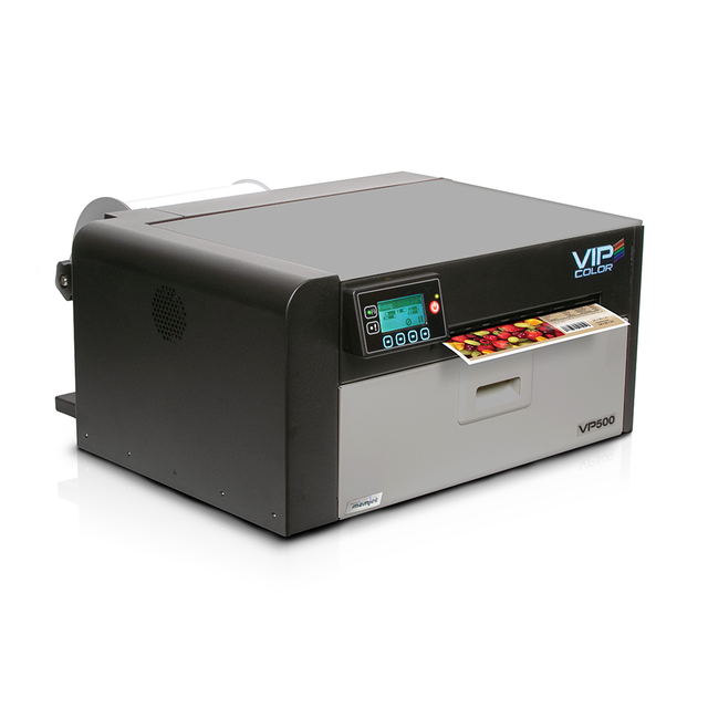
The VIPColor VP550 is engineered for businesses that need high-speed label production without compromising on colour clarity or durability. With water-resistant dye inks and a resolution of up to 1600 x 1600 dpi, it's especially suitable for products that may be exposed to moisture, like food, beverage, or cosmetic items. Its large-capacity ink tanks help reduce refill frequency, making it efficient for frequent small-batch runs.
Pros:
-
Ideal for products exposed to moisture or refrigeration
-
Cost-effective with reduced ink replacement frequency
-
Suitable for short-run, on-demand label printing
Cons:
-
Limited to dye-based inks, which may not be as durable as pigment-based options
2. Afinia L701
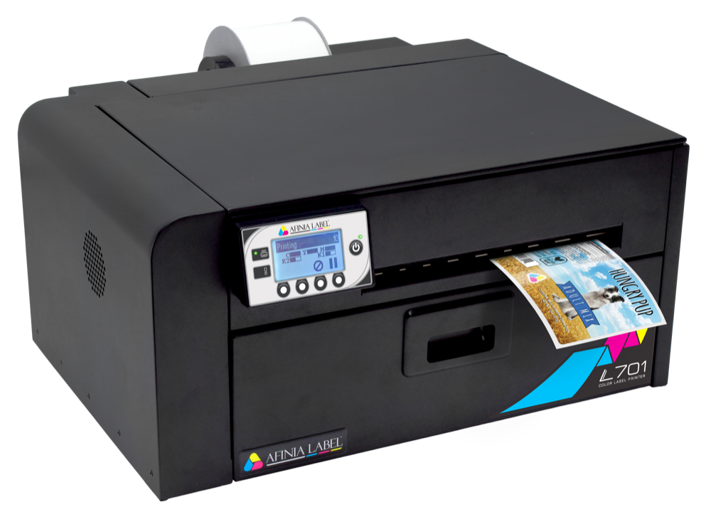
Powered by Memjet technology, the Afinia L701 delivers blazing-fast printing speeds while maintaining sharp, vibrant output—ideal for brands scaling production. It supports wide-format label rolls and is suited for medium to high-volume operations across various industries. Whether you're printing in bulk or running multiple printers simultaneously, the L701 is designed to keep workflows smooth and consistent.
Pros:
-
High-quality, full-colour prints at rapid speeds
-
Cost-effective for mid-range production volumes
-
Suitable for multiple-printer installations
Cons:
-
Primarily uses dye-based inks, which may not be water-resistant
-
May require regular maintenance to prevent printhead clogging
3. Primera LX910
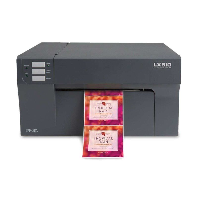
The Primera LX910 stands out for its versatility—it allows users to switch between dye and pigment inks based on their label durability needs. With a compact footprint and user-friendly interface, it’s a favourite among small businesses and startups looking for quality with minimal hassle. The built-in cutter adds convenience for continuous label rolls, while compatibility with both Mac and Windows makes integration seamless.
Pros:
-
Versatile ink options for different label durability needs
-
Integrated cutter enhances production efficiency
-
User-friendly with broad OS compatibility
Cons:
-
Ink cartridges can be expensive over time
Innovations in Label Colour Trends
In recent years, numerous innovative trends have emerged in the realm of colour psychology for product labels. From exciting colour gradients to bold colour contrasts, brands are becoming more adventurous with how they use colour and font to attract attention and evoke emotions. Moreover, we're seeing an increased emphasis on sustainability and mindfulness, with brands leaning towards earthy tones and muted pastels. Anticipating and staying updated with these colour and font trends can help you ensure that your product labels remain visually relevant and compelling in the competitive marketplace.
What are the Emerging Trends in Colour Psychology for Labels?
Colour psychology is constantly evolving, and several exciting trends are shaping how brands approach their label designs. Here’s what’s gaining traction:
-
Bold, Saturated Colours: Bright and vibrant colours, like electric blues, fiery reds, and even cyan, are being used more often to grab attention quickly and make a lasting impression. These colours are perfect for products that want to stand out on crowded shelves.
-
Soft, Subdued Hues: On the flip side, softer, more calming colours like pastels and muted shades are gaining popularity, especially for products related to relaxation, mindfulness, and sustainability. These colours evoke feelings of calmness and peace.
-
Gradient Colour Schemes: Gradient designs, where colours seamlessly transition into each other, are becoming more common. This technique results in visually striking and appealing labels that attract consumer attention and spark curiosity.
By staying updated on these trends, businesses can leverage the growing influence of colour psychology to create labels that resonate with consumers and boost engagement.
Futuristic Approaches to Label Designs
Technology is continuously evolving, and it’s bringing new possibilities for colour psychology in label design. Here’s what to watch for:
-
Interactive or 'Smart' Labels: These labels change colour based on factors like temperature, light exposure, or even consumer interaction. It’s an exciting trend that adds a dynamic and futuristic element to product labels.
-
Holographic and UV-sensitive Inks: With advances in printing technology, brands can incorporate eye-catching effects like holographic foils or UV-sensitive inks. These labels change and shine under different lighting, creating a sense of novelty and surprise for consumers.
-
Minimalism in Design: Simplicity is making a comeback. Brands are opting for clean, minimal designs which transcend cheerfulness, with subtle colour palettes that reflect transparency and authenticity. These labels appeal to consumers who value simplicity and a focus on the product itself.
These futuristic trends open up exciting opportunities for businesses to create labels that are not just functional but also interactive and memorable, setting their products apart in a competitive marketplace.
Ready to Maximize Brand Potential through Colour Psychology?

When it comes to product labels, the colour you choose is more than just a design element – it’s a strategic tool that can influence consumer decisions and emotions, especially for food products. With the right colour scheme, your labels can speak directly to your audience, draw them in, and set your brand apart from the competition.
At DuraFast, we understand the vitality of colour psychology for creating labels that don’t just look good but also resonate deeply with consumers. Whether you’re looking for vibrant hues to grab attention or soft shades to evoke calm, our team can help you choose and design labels, including custom label, that reflect your brand’s identity and captivate your target audience.
So why wait? Let’s work together to elevate your product packaging with labels that not only stand out but also drive sales and foster deeper emotional connections with your customers.
Contact us today and see how our innovative labelling solutions can make your products pop off the shelves!
Frequently Asked Questions
What does each colour signify in product labelling?
Each colour holds a specific significance in product labelling, evoking particular emotions. For example, shades of red can excite and stimulate, increasing the heart rate, green suggests nature and freshness, blue instills trust and calmness, yellow draws attention and exudes clarity and happiness, and black symbolizes sophistication and luxury.
How often should I reevaluate the colour scheme of my labels?
While it's essential to remain consistent with your colour scheme for brand recognition, periodically evaluating your colours can be beneficial. Changes in consumer preferences, market trends, or a significant shift in your brand identity or product line could warrant a review of your colour scheme.
What tools can help me choose the best colours for product labels?
Several online tools can assist in picking the best colours for product labels, including Adobe Colour CC, COLOURlovers, and ColourBlender. They allow you to explore, customize, and save colour schemes, in RGB, giving insights into current colour trends and facilitating experimentation with different colour combinations.
How can I test the effectiveness of my label's colour scheme before full-scale production?
Before rolling out your product labels on a large scale, you could create sample designs using different colour schemes and conduct focused group tests or online surveys to gather feedback on the personality of your brand with a potential rebrand. Alternatively, consider releasing a small batch of your product with the new labels and assess customer responses.