Front-of-package nutrition warning labels in Canada: rules and requirements
16th Nov 2026
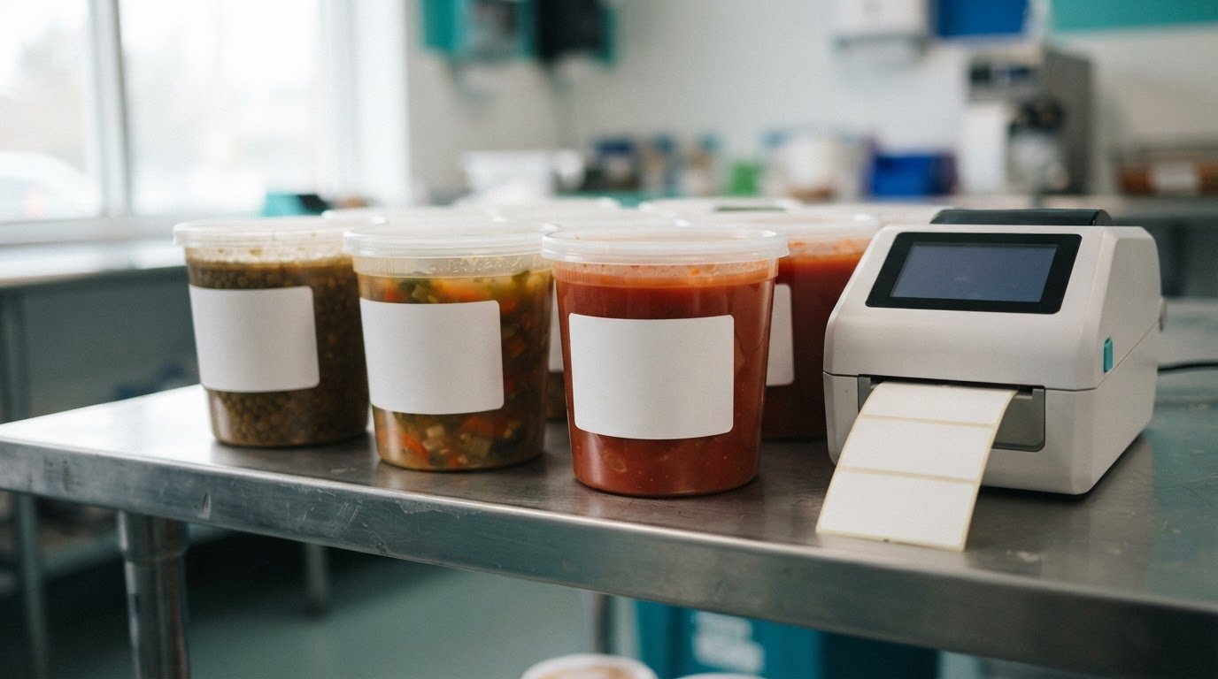
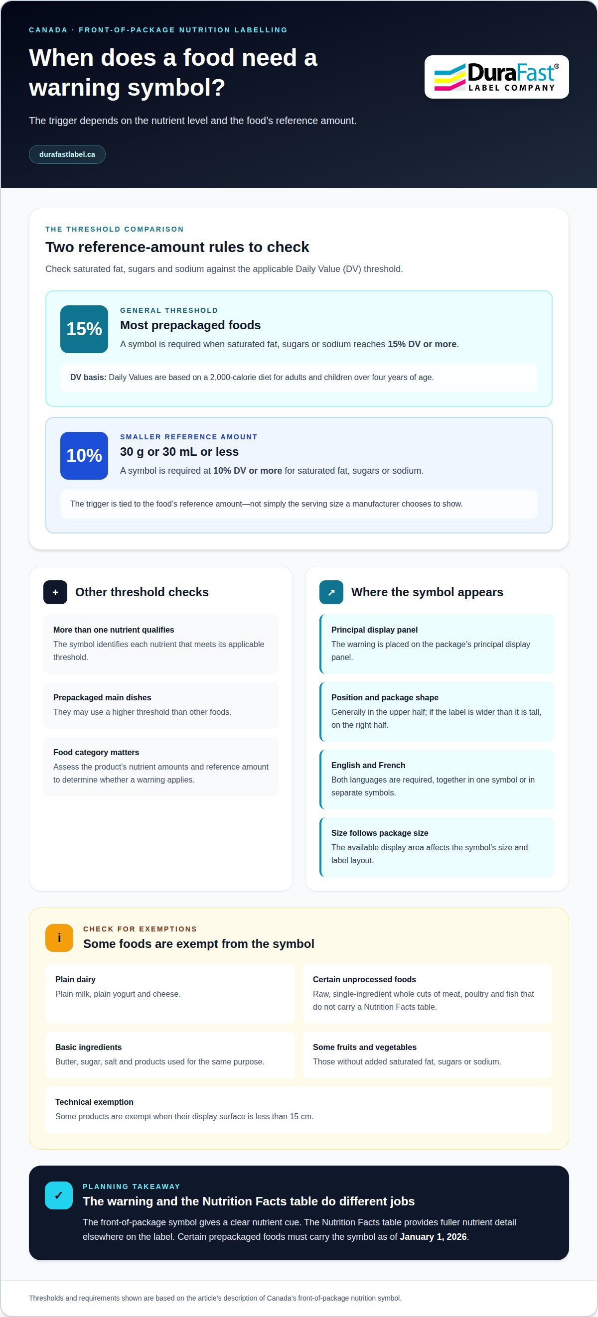
A warning symbol can change what appears on a package, but the threshold depends on the food. In Canada, front-of-package nutrition warning label printing must account for a black-and-white symbol identifying high saturated fat, sugars, sodium or a combination; the general trigger is 15% or more of the Daily Value, with different thresholds for some foods. According to Health Canada, foods with reference amounts of 30 g or 30 mL or less require a symbol at 10% or more of the Value.
It’s easy to focus first on how the symbol looks. Preparing a compliant label also means identifying which products need it, where it must appear, and how mandatory rules differ from voluntary labelling.
This guide explains what Canada’s warning symbol communicates, its main requirements and exemptions, and how trade and legal considerations can affect labelling decisions. It also explains the role of the Nutrition Facts table and what the rules mean when planning printed product labels.
Key Takeaways
- The black-and-white symbol flags high saturated fat, sugars, sodium, or a combination. The threshold varies by food type and reference amount.
- For foods with reference amounts of 30 g or 30 mL or less, Health Canada requires a symbol at 10% Value or more for saturated fat, sugars, or sodium.
- Mandatory requirements apply to certain prepackaged foods as of January 1, 2026. Knowing which products qualify helps guide label planning.
- Printing costs depend on practical choices such as label size, material, print method, and production volume, so compare these factors when planning a run.
- Small packages can bring added layout and printing constraints. The article explains how to consider those alongside label requirements and trade-related concerns.
Appearance and content of the warning symbol
Canada’s front-of-package nutrition symbol uses a black-and-white design to identify foods high in saturated fat, sugars, sodium, or a combination of these nutrients. It indicates which nutrient exceeds its applicable threshold, rather than showing the product’s full nutrient profile. Shoppers see the warning on the package’s principal display panel, while the Nutrition Facts table provides detailed nutrient information elsewhere on the label.
For most prepackaged foods, the general threshold is 15% of the Daily Value or more for saturated fat, sugars, or sodium. The percentage is calculated against the Daily Value, which is based on a 2,000-calorie diet for adults and children over four years of age. If a product meets or exceeds the relevant threshold for more than one nutrient, its symbol identifies each nutrient that qualifies. The rule therefore depends on the food’s nutrient amounts and reference amount, not simply the serving size a manufacturer chooses to show.
Small reference amounts have a different trigger. According to Health Canada, foods with reference amounts of 30 g or 30 mL or less require a front-of-package symbol at 10% DV or more of saturated fat, sugars, or sodium. Prepackaged main dishes may use a higher threshold than other foods. These distinctions matter when deciding whether a product’s formulation and package require a warning.
The symbol must appear in English and French, either together or as separate symbols. Its position depends on the package layout: it appears on the principal display panel, generally in the upper half for most package shapes. If the label is wider than it is tall, the symbol belongs on the right half. The package size determines the symbol size, so the available display area affects the layout.
Not every food requires the nutrition symbol. Exemptions include plain milk, plain yogurt and cheese, as well as raw, single-ingredient whole cuts of meat, poultry and fish that do not carry a Nutrition Facts table. Butter, sugar, salt and products used for the same purpose are also exempt. Fruits and vegetables without added saturated fat, sugars or sodium are among exempt foods. Some products receive technical exemptions when their display surface is less than 15 cm.
These rules make label space a practical consideration, particularly for compact packages. A label must accommodate the warning alongside other required information, and a small display panel may affect its dimensions or placement. For comparison, a separate compact-format example is inkjet card grading labels, which also require attention to the available label area.
Consumer research helps explain the symbol’s prominent placement. A review found that front-of-package labels are more visible to consumers and can guide healthier choices. It also noted that further research is needed to establish whether labels influence purchasing choices. For food businesses, the practical takeaway is that the symbol provides a clear, front-facing nutrient cue, while the Nutrition Facts table remains essential for fuller detail.
Fruits and vegetables without added saturated fat, sugars, or sodium are among the exempt foods because of their protective effect on health. The condition matters: the exemption described here applies to foods without those additions. The symbol must still be presented in English and French, together or in separate versions.
A review cited on the page found that front-of-package labels are more visible to consumers and can guide them toward healthier choices. This suggests they may help shoppers compare options, but visibility and guidance alone do not establish whether labels change purchasing choices. Further research is needed to determine whether they influence what people buy.
Mandatory versus voluntary labelling
Canada’s front-of-package nutrition symbol requirement is mandatory for certain prepackaged foods. As of January 1, 2026, products that meet the applicable criteria must carry the symbol; a business can’t treat it as an optional promotional choice. The Canadian Food Inspection Agency enforces the requirement under the Food and Drug Regulations. That makes accurate product classification and label control important parts of packaging decisions.
Voluntary labelling is different from a required warning: it covers information or design elements a business chooses to add. A manufacturer may want a front-facing message to highlight an ingredient, explain a product feature, or communicate a nutrition attribute. But voluntary messaging does not replace a required symbol, and it should not obscure information consumers need to see.
Mandatory symbols can also affect product formulation. A warning may prompt a company to review its recipe, ingredients, and nutrient levels. Compared with voluntary labelling, mandatory labelling is more likely to encourage reformulation aimed at avoiding a high-in-saturated-fat, sugars, or sodium classification. This might involve adjusting an ingredient or changing the formulation, depending on the product and its intended characteristics.
Reformulation is a business decision, not a substitute for the labelling rule. If a product still meets the threshold, its package must carry the symbol. A recipe change may also affect the product’s nutrient profile and label information. For example, reducing an ingredient that contributes sugars could change the amount declared, but the product’s overall composition determines whether it still qualifies.
Fruits and vegetables show why product categories matter. Some are exempt when they contain no added saturated fat, sugars, or sodium. A business should not assume that a voluntary claim or an ingredient change creates an exemption. The relevant question is whether the food fits a stated exemption or meets the applicable criteria for the warning symbol.
Voluntary nutrition claims also have limits. Some nutrient-content claims and health claims related to saturated fat, sugars, or sodium are prohibited on products classified as high in those nutrients. Consider any front-panel message alongside the product’s classification, ingredient information, and other label content. Adding a voluntary statement does not make a restricted claim acceptable.
International evidence can provide context, but it isn’t a Canadian rule. A UK Department for Environment, Food and Rural Affairs-commissioned analysis found mandatory legislative changes accounted for less than 14 percent of companies’ relabelling on average. That finding concerns UK companies, so it shouldn’t be treated as a forecast for Canadian products or businesses.
For Canadian packaging teams, separate the decisions: determine whether the food requires a symbol, then consider any voluntary front-panel information without confusing or displacing required content. If label-production planning is part of that work, discuss your label requirements.
How much does it cost to print compliant front-of-package nutrition warning labels in Canada?
There is no single print cost for every Canadian food package. The cost of front-of-package nutrition warning label printing in Canada depends on the label format, material, production method, order size, and number of versions required. A short run for one product has different setup needs from ongoing production across several package sizes. The symbol’s required space also affects label dimensions and material use. A useful estimate starts with the packaging and production plan, not the warning symbol alone.
Label size is a direct cost factor. A compact package may have less room for the warning and other content, while a larger format may use more material per label. For example, a product team updating a small jar and a family-size carton may need separate layouts. Each format can affect material use, setup, and the number of versions kept in circulation. Careful layout planning can reduce avoidable changes and unused labels.
Order quantity affects the economics of a print run. A small batch spreads setup and file preparation across fewer labels, while a larger run spreads those activities over more units. However, ordering extra labels can create waste if the recipe, package, or label information changes. A product with several flavours may need distinct versions, while one stable design may suit a longer run. The right balance depends on demand, product changes, and storage capacity.
Material and printing method also affect the estimate. The label stock must suit the package surface and the conditions around the food. A refrigerated product may face different conditions from a dry pantry package. Printing requirements matter too: a black-and-white warning may share a label with colour branding and other information. The complete design, rather than the symbol alone, determines production needs.
In-house printing and externally produced labels have different cost structures. In-house production involves equipment, supplies, labour, maintenance, and job preparation time. An external print run can consolidate production, but artwork changes and order quantities can affect the project. For example, a company updating a Nutrition Facts table may need to manage old stock alongside revised labels. Planning the transition can reduce unusable inventory.
To compare options, prepare a consistent specification: package dimensions, label size, material, print colours, quantity, product variations, and expected reorder pattern. Include artwork preparation and finishing or application requirements. Then compare the full cost per usable label, not just the quoted price for a roll or batch. A label that prints reliably and fits the package can help prevent rework, rejected stock, and production delays.
For front-of-package nutrition warning label printing in Canada, compliance shapes the design, while production choices shape the cost. Keep the symbol layout and other label content consistent where possible, and align print quantities with product turnover. An estimate is more useful when it accounts for the package, finished label, and print volume together.
What printing methods and materials work best for small packages and nutrition warning labels?
Small packages leave less room for a warning symbol, product information, and branding. The printing method must reproduce the approved artwork clearly at its intended size. The material must also suit the package surface and the conditions around the food. A glass jar, flexible pouch, and paperboard carton have different surfaces, so the same label construction may not suit every product.
Digital inkjet printing can produce colour product labels, including artwork that combines a black-and-white warning with brand elements. It can also accommodate different designs across a product range. For example, a producer with several flavours can prepare separate versions while keeping common layout elements consistent. The finished artwork must still preserve the warning’s required appearance and legibility.
Inkjet label materials are one option for businesses considering digitally printed labels. The right stock depends on the package and how the label will be handled. A label on a smooth, rigid container may perform differently from one on a flexible pouch. Surface texture, curvature, moisture exposure, and handling can all affect label performance.
Thermal transfer is another label printing method. It transfers ink from a ribbon to label stock, so the ribbon and material combination matters. Direct thermal printing uses heat-sensitive label stock and does not require a ribbon. Each method has different consumable needs, so consider the artwork, stock, printer, and production workflow together.
For a small package, assess the available design space before selecting a print process. A crowded label can make the warning harder to distinguish from surrounding content. Review the complete package layout, including the symbol, product name, ingredient information, and other label elements. A test print at the intended size can show whether text or symbol details remain clear on the actual material.
Choose material to suit the product’s environment. A frozen food label may encounter condensation, while a dry pantry product may face different handling conditions. The ink or ribbon, face stock, and adhesive all contribute to the finished label. Testing the complete construction on the actual package can help identify lifting, smearing, or readability issues before a production run.
Small-format production also calls for careful file and version control. Keep the warning artwork consistent across product variants, and use separate files when package dimensions or content differ. A revised formula or label layout should not be mixed with older artwork during printing. Clear version names and a controlled print queue help reduce the risk of applying an outdated label.
For a practical selection, match the label printer and material to the package surface, print volume, colour needs, and exposure conditions. Then assess a printed sample on the finished package before committing to production. Discuss label printing options for your package to plan a suitable method and material combination.
DuraFast Label Company Canada: Dymo LabelWriter label printers
DuraFast Label Company Canada offers reliable label printers for businesses producing product labels in-house. The right printer depends on the label format, package, print volume, and artwork requirements. A compact package may need a different label layout than a larger container, so confirm that the selected setup can reproduce the complete label clearly.
For colour product labels, VIPColor, Afinia, and Toshiba printers are excellent options to suit various operational needs. The printer supports production, but compliance depends on the finished label’s required content and layout. Match the equipment to your workflow and the labels you plan to produce.
If you’re planning label production for Canadian food packaging, contact DuraFast Label Company Canada to discuss your printing requirements.
Plan your next packaging run with confidence
Before your next packaging update, align the label artwork, product versions, and production needs. A clear handoff between the teams responsible for product information and label production can help keep revisions organised as packaging changes.
For front of package nutrition warning label printing in Canada, choose a printer that suits the finished label design and your production workflow. DuraFast Label Company Canada offers VIPColor, Afinia, and Primera printers for businesses considering in-house colour label production. The right fit depends on your operation’s equipment and label requirements.
Take the next step by discussing your label-production plans and printer options with DuraFast Label Company Canada. A considered plan can help you move forward with greater clarity.
Frequently Asked Questions
What are the required size, placement, wording, and design specifications for the Canadian nutrition warning symbol?
The symbol is black and white, identifies saturated fat, sugars, sodium, or qualifying combinations, and must appear in English and French. The package size determines the symbol’s size. It belongs on the principal display panel, generally in the upper half; if the label is wider than it is tall, place the symbol on the right half. For example, a wide carton and a tall jar may require different placement. The Nutrition Facts table remains separate.